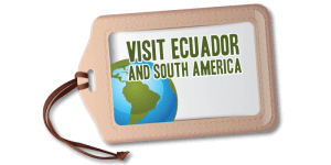
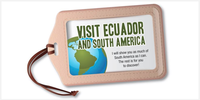
Glad to present you the brand NEW logo for the blog!
My aim with this logo is to give a visual identity that describes the purpose of the blog and at the same time helps with its branding. This image will give Visit Ecuador and South America¨s blog to get differentiation with the ones that our colleagues may have, as this is a blog meant to have a special focus in all related to travelling only in South America.

Concept: Carmen Cristina Carpio T.
We want to create a memorable impression to all our followers and readers online, that is why we have chosen the following elements:
Isotype: A map of South America with 2 main colors. Green representing the lush amazon rainforest and blue, for the Pacific and Atlantic Oceans that border this Southern part of America.
Logotype or typographic element: The name of the blog “Visit Ecuador and South America” which is used accross all social media platforms and that states clearly what is the purpose that I have with my blog.
At the side below the logo, as well as in all my articles I have a clear slogan that states my mission with each article.
I will show you as much of South America as I can.
The rest is for you to discover!
Please help share the love, by liking and sharing this post with friends and family on our Facebook page.
The blog: www.visitecuadorandsouthamerica.com
Like Visit Ecuador and South America on Facebook, follow the blog on Twitter and Instagram, and subscribe on YouTube.
You can send me an email to:


